It was a ton of fun looking at everybody’s projects. One of the things that I realized while sitting there listening to everybody speak was that in my project where I took the egg onto the trail. It was really the first time I had ever slowed down. You go as fast as you can on town run, firstly because its fun, secondly because its annoying to have to let faster bikers past you. To just…stop every once in awhile to take pictures, it was a different way to enjoy the trail entirely.
Class Takeaway 1
What resonated with me? I don’t usually stand amongst artists and say that I belong, as I mentioned when I introduced myself. I saw one or two other level designers and 3D environment designers out there so I wasnt completely out of my element. Then again when I am I JAKE SANKARI out of my element right? I’m primarily interested in collaborating with the other 3D students as I am in my capstone right now. It’s a bit early for somebody like me to be moved or have great appreciation for anything this class has shown so far. Should someone claim to have been greatly inspired in their first class takeaway I recommend backing away slowly. TLDR: Too early to tell, will enjoy this first assignment (egg) and find suitable coloring book soon!


Final Portfolio-Randomonium
WELCOME TO MY FINAL PORTFOLIO! In three segments: Randoms, Angels & Demons, and Vector art. LETS BEGIN
Not too long ago I made a Doctor Who Guess Who custom set, so this is the box art I designed, printed, and pasted to the front of the box. Mostly copyrwritten BBC stock art from the actual show. However, because this is just my for fun portfolio…not so big a deal.

The entire background was created from scratch in photoshop using the a series of distorted layers under various blend modes, then added the Spartan from the Halo series. Could make a cool desktop background.

Based on the famous work of art “Lunch Atop a Skycraper” Keanu Reeves joins a motley crew of construction workers!

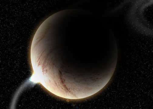
Another photoshop from scratch. Used some of the planet creation concepts you showed in class.
This is supposed to be my “selling” work. I designed it like some might for a Converse poster to attract customers. I shows how free and fashionable wearing Converses can be with the logo and everything included.

One manipulation I always go back to is mixing animals and plants :3 This one….underperforms but it’s what I ended up with!

This is the revisited image, the perfected par is on the right. I basically removed all the failing aspects from teh midterm portfolio version. I never liked how fantastical and purple the left one looked so I played with some adjustment layers to even it out…I also added a floating piano :3

Another that…I just threw together and had no clue what I was doing ![]()

Final Portfolio-Angels & Demons
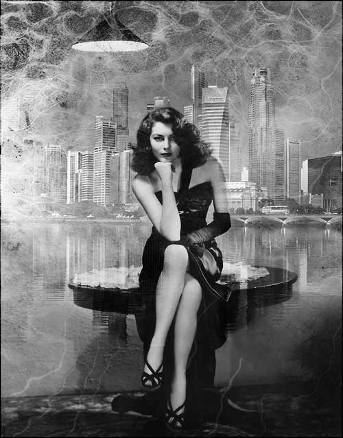
ANGELS AND DEMONS TIME!!! WHOOO! A little while ago I was marginally involved in a photoshoot in which many film noir themes were prevalent. I took the initiative to go a step further and completely vampirize myself…I was kinda vampirey enough in the original shot anyway so the conception of the idea wasn’t that big a deal.
Lowered jaw line to accomadate the fangs…added a vampirey ear and claws. Oh yeah and the veins. A lot of layer masking.

This one was supposed to be based around feminine qualities. You clearly have a beautiful woman in the foreground. Beauty that is exemplified by her pose, that of The Thinker. A smart, beautiful textured woman.
MASKS 😀
MY FAVORITE: The Armour
This was a single appropriated image of a bunch of suits of armor in a hallway, I mirrored the image and blended them together to appear as though they are in a single (and hilariously well-light) hallway. Free light brushes provided the “god light” on the right and smoke brushed provided the burning watcher eyes on the left. Some basic adjustment layers helped fully ground the metaphors.

Another DEMON, Jack the Ripper was a serial killer of prostitutes and therefore makes a badass portfolio image.

MY SECOND FAVORITE! This one is just fan-freaking-tastic! I made a guy from the highway into an awesome Rock God Minotaur!

Compared to the others in this portfolio I admit this jumping one is kinda lame ![]() I just started it and couldn’t think of anywhere else to go so I just slapped it together last minute.
I just started it and couldn’t think of anywhere else to go so I just slapped it together last minute.

Final Portfolio-Vector Art
This section of my portflio is composed of vector art. Firstly comes my Anarchy piece which represents the typography component. Anarchy is represented by a vector-based ambigram across the composition, it is the exact same image upside down and rightside up. The background is made up of symbols of of both imperialism and liberty. Just a collage of oxymoronical symbols that I thought was pretty cool essentially.
Vector art done in Alchemy exported as a png file and thrown to photoshop. Basic stuff.

Next is a wonderful “child-friendly” (hint hint!) background for a computer. Again mostly vector art but I like claptrap from Borderlands and one of the themes from Borderlands is anarchy so I included the anarchy symbol in here as well.
Same as the Anarchy process

This composition is totally about the color red…more like a bland lightish red really but red nonetheless. On the left you see a downcast face, a face with some kind of metal covering it’s mouth and nose. The text “fabrication machine” can be seen on the bottom which I just thought was a fun reference to the process of creating all this vector art which includes a lot of mirroring.
A lot of vector art was done using Alchemy with the gradient and final text editing done in photoshop after exporting.

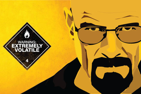
YES YES YES BREAKING BAD! I essentially vectorized Walter White form breaking bad to make him this awesome kind of badass cartoon! I kept the background image though because it adds a cool gradient that corresponds to the highlight on the left of his face (viewing perspective)
A photo taken from google, I put it into photoshop and used the pen tool to make paths around areas of detail, then used illustrator to fill these areas and make it vectorized.
http://www.youtube.com/watch?v=hXYfO6cDT3w <–This ought to explain everything
Alchemy vector art and a Doctor Who background believe it or not xD

For this one I just thought of something that annoyed me more than anything in the world and what I came up with was…poorly written instruction manuals -_- hence the name “Ikea Instructions”
Alchemy art mixed with a little photoshop editing.

Surrealism
The first image is called “Gun Pointed at the Head of the Universe”…like almost everything I do it has a reference to game/movie/tv/pop culture. This one is a shoutout to what I would describe as the best game that has ever been made…Halo: Combat Evolved. At the time this game was an absolute revolution in every aspect. The visuals were awesome, the score was one of the only games ever to have a full orchestra and choir performing the background music. The multiplayer was the absolute best that had ever been played. The game became iconic and one of the levels in the game featured the subtitle “Gun Pointed at the head of the Universe” so I essentially put 2 and 2 together and SHAZAM. There you have it. The next piece is untitled. It’s just a bunch of boats sailing on clouds. It’s supposed to give you the emotion of relative weightlessness. That if when you dream you can do the impossible. Of course when you wake up all of those dreams are realistically dashed because the density of a pirate ship is much greater than the density of a cloud so sailing on it would be not ever be a dream you could achieve…but WHILE you are dreaming it’s totally cool. The FINAL Surrealism image is a view of a large morphing cube from inside a cave. I wanted to make some kind of “window” image. A window to another world. To the craziness that is right outside your house. I assume that THIS is would Dr. Suess would see (were he still alive) if he looked outside his window. It’s a tribute to the Twilight Zone, and The Outer Limits. Two long-running


scifi shows about the randomness in the universe.
The Zombie
In honor of The Walking Dead, I created this awesome manipulation. I used a lot of blend modes namely overlay, softlight, and multiply to get the scar tissue to appear to be decomposing and destroyed. I extracted the background and made a soft green gradient. After I used a fiber render tool to create the soft orange streaks to just to make the background seem less plain and add more to the image in general.

Randomonium
This one is pretty random. They started as three separate images of me on my couch playing Halo. The trick was changing my clothes fast enough to keep the sunlight from changing too much so as to ruin the image…Lots of extraction and several VERY difficult layer masks!
The Geekdom


Like a true fanboy I also felt the need to throw myself into a few more pictures. Starting with the movie 3:10 to Yuma. I am in the background. I used the dodge and burn tools to match myself with the lighting in the scene. Next up is my Dr. Who self portrait. I found that if I ‘swoofed’ my hair over I looked somewhat like the 11th Doctor from the show. Added a cool spacey background and a radial gradient for accenting! Final in this category is SLENDERMAN. I am actually going to be slenderman for Halloween and this Friday I will be at the Informatics building dressed as Slenderman. That IS a photo of me in the background of the image…just chillen. In all of these I used my extraction techniques both the ones I learned on my own and the ones learned in class. I think the well done edges around my body really emphasize the skill I have gained in that area.
